Public transports in London
June 4, 2012Updated April 2021 – see notes below
I’ve been playing with maps for the past few weeks in an effort to find the best location for my next flat, cross-referencing several data sources to assign scores to offers from agencies and property owners.
I started with a small rendering engine for OpenStreetMap data, incorporating more data sources as I found them. It turns out that creating a small rendering engine is pretty simple as long as you don’t bother drawing the roads:
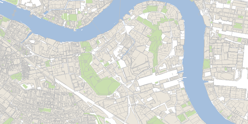
The rendering on its own is clearly inferior to Google Maps, but the data itself is very valuable: being able to understand how streets are connected together makes it possible to implement search algorithms on top of a graph representation of the city. So instead of focusing my efforts on building a better renderer, I’ve decided to keep using Google Maps as a background image only and to implement my application using simple projections on top of that background.
Visualizing the TfL journeys 
In my search for relevant data sources, I downloaded a copy of the Transport for London (TfL) schedule list, describing each train, bus, or boat and its planned stops with their geographical location. The files are in a TfL-specific format, which can be converted to the more accessible GTFS.
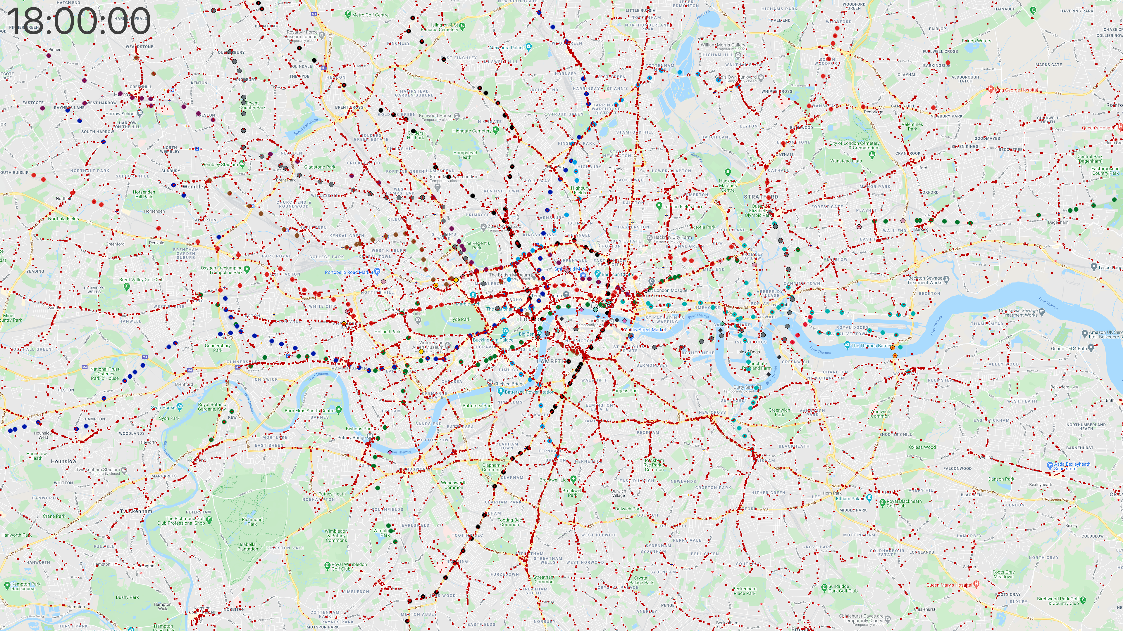
An application that builds on several input feeds to print out a result based on their interaction needs cleaned-up data sources with minimal bias or error rates. In order to make sense of the TfL schedules, I plotted the journeys of every vehicle I knew of, looking for obvious gaps in the data. Tube trains and the DLR are plotted with colored circles, while buses are represented as red squares.
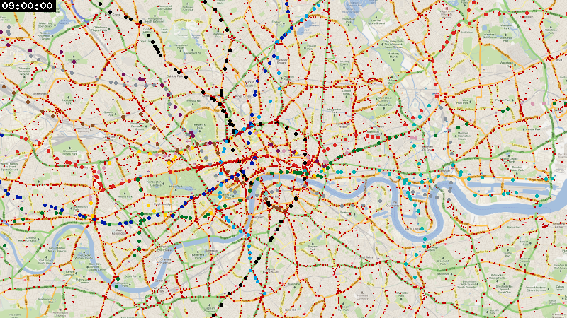
And with a wider view:
April 2021 update 
After almost 9 years leaving this project untouched, I recently re-discovered the code I used to generate these videos and decided to try re-rendering them in higher quality, this time in 4K at 60 frames per second.
I downloaded the London Tube schedule in GTFS format from the data analysis platform hash.ai (it’s still not available from TfL), and the London bus timetables on the British government’s Bus Open Data Service website.
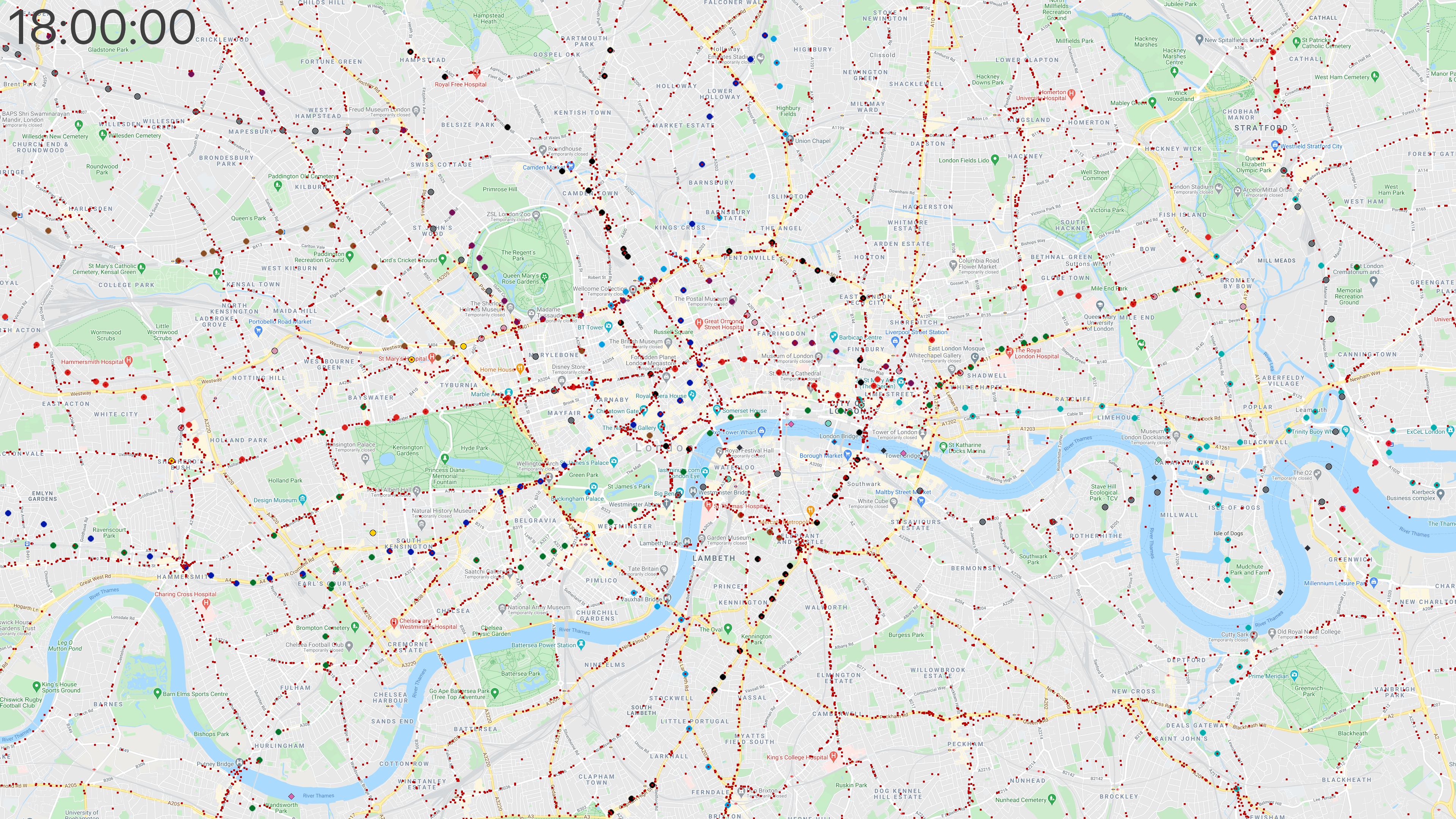
In addition to trains and buses, this version also includes river boats, displayed as diamond shapes (look for them as they bounce from dock to dock).
Center of London 
Here’s the new version, zoomed in to show the center of London:
You can also use the video player below to watch it in 4K, not re-compressed by YouTube:
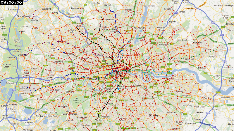
Wider view of London 
And zoomed out for a wider view, on YouTube:
Again, here is the higher-quality source video file for this different zoom level:
The individual frames 
Each video was generated with ffmpeg by processing 21,600 4K frames in PNG format (3,840 × 2,160), which amounts to a runtime of 6 minutes at 60 frames per second. The PNG files are over 200 GB per video, but the resulting video files are only 2-3 GB (H.264 is pretty impressive!)
Here is what a 4K frame looks like (click to view the full 11 MB file):
And the same frame at the wider zoom level (full file is 9 MB):
Lessons learned 
This visualization made a few things clear for me:
- I am confident that I have enough data to use in my application, even though there seem to be some minor issues with buses.
- London has a lot of buses! The TfL data includes over 14 million stop times.
- Tube lines are subject to frequent outages for maintenance, especially on the weekend. The videos don’t reflect these as they only show planned journeys.
The code is available on GitHub, but you will need a converted GTFS dump of the TfL data to run it yourself. Background images are © Google.
Follow me on twitter for more experiments like this one.